Community service finder website (UP)
(Helping the less privileged)
(Helping the less privileged)
UP is a community-based platform designed to connect people who want to give with those in need. The goal was to make contributions—whether time, money, or resources—feel simple, impactful, and transparent. This project allowed me to practice end-to-end UX design, from research and wireframes to final UI and prototyping.
Role : UI/UX Designer | Timeline : 3 weeks | Tools : Figma
From my interviews, I found that while many individuals want to give back, they often feel their contributions are too small. On the other hand, community organizers struggle with limited resources, poor documentation, and difficulty reaching more people.
Name : Chi Chi (Community Organizer)
Age : 28
Location : Lagos
User Profile : Wants to contribute and help others but feels limited by her resources. Prefers structured ways to give rather than random acts.
Goals : Raise funds and reach more people for her projects
Frustrations :
1 . Limited resources
2 . Can't reach out to more people.
3 . Difficulty keeping proper record showing transparency
Pain Point: Can’t reach enough donors and volunteers
How UP Helps: Central platform to showcase projects and attract support
Pain Point: Struggles with poor documentation and tracking
How UP Helps: Built-in tools for recording contributions and managing events
Pain Point: Feels her projects don’t scale beyond a small circle
How UP Helps: Shows project visibility, impact metrics, and connects with more people
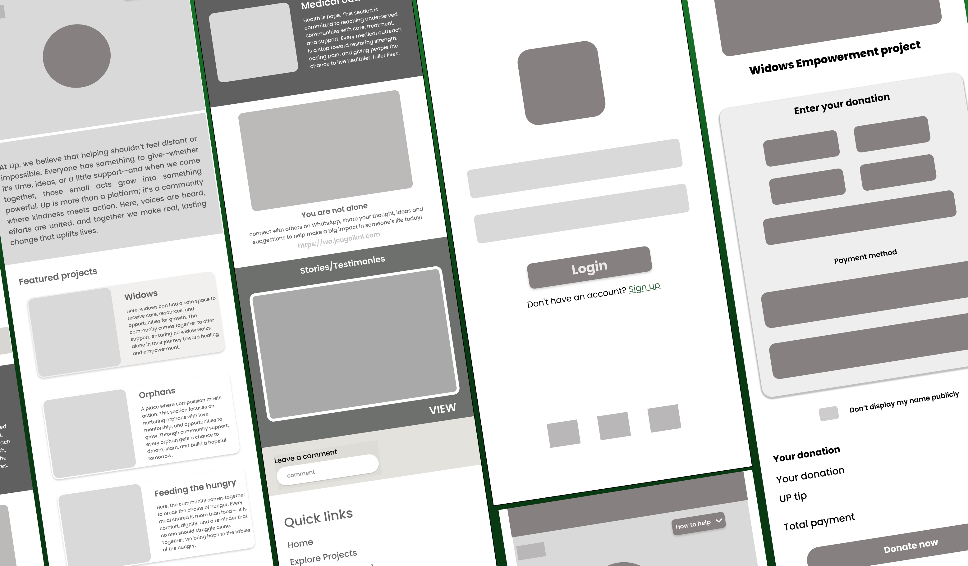
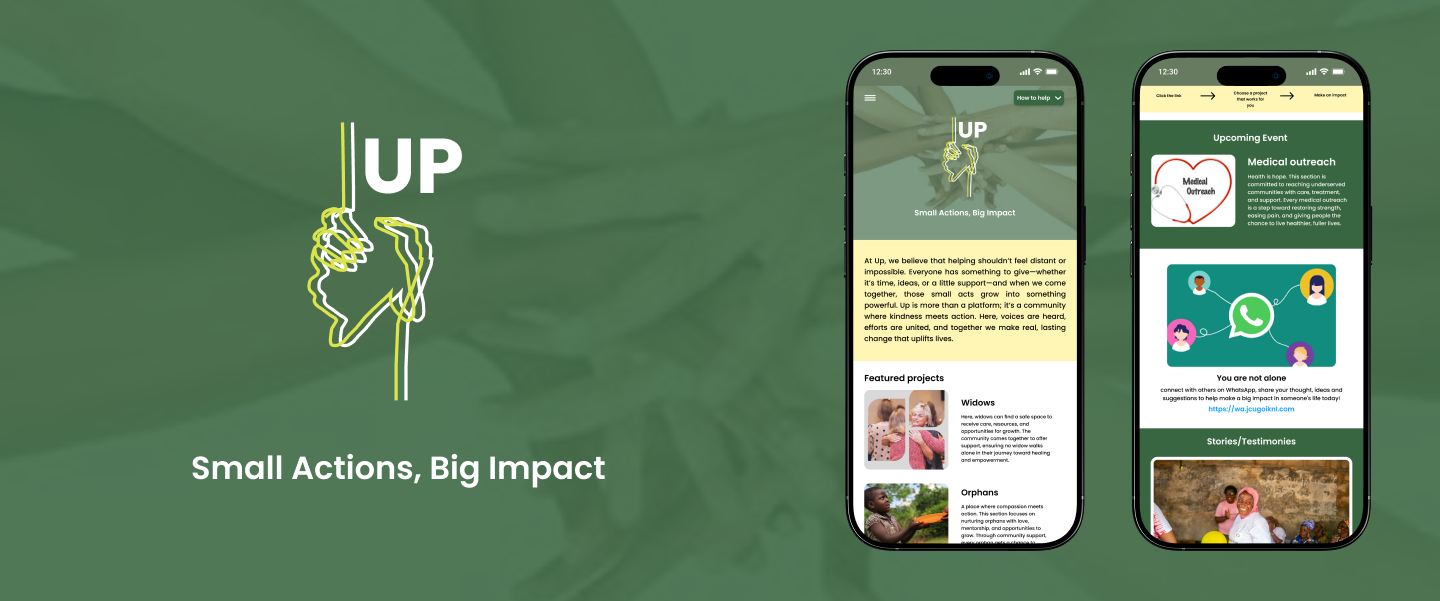
THE FINAL SCREENS

Login page
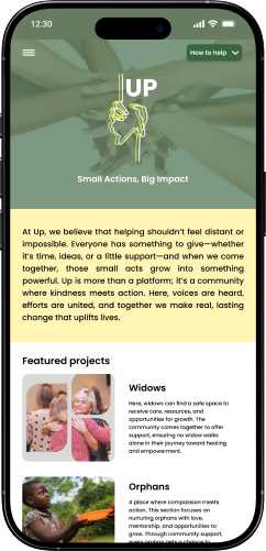
home page

Project page
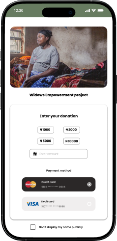
Donation page
The colors were chosen not just for aesthetics, but to convey specific emotions (warmth and trust).
At first, I tried adding too many features, which made the design messy and confusing. I later realized the platform worked better when I focused on the essentials which are the project visibility and contribution tracking.
One of my biggest struggles was translating interview insights into actual features. Initially, I tried solving everything in one flow, but that didn’t work. Breaking it into stages such as outreach, organization, and impact made the design clearer.
I spent too much time polishing early screens instead of testing quickly. Switching to rough sketches and low-fi wireframes helped me explore ideas faster and save time.
This project reminded me how powerful small contributions can be when combined. It also showed me that people don’t just need a platform — they need trust and transparency to feel confident giving. For me, the biggest lesson was to keep testing, keep simplifying, and always design with the community in mind.
For more work inquiries, or to grab a coffee do email me at olayinks97@gmail.com
Thank you for reading! ❤
Scroll To The Top :